
3A: Magazine Cover Project
Client Situation
You have been hired for an internship with a prominent design agency and your first project is to design a magazine cover. This project could very well launch a new career if you combine good typography skills with the design principles to create an engaging piece that will communicate your message to the target audience. Your cover needs to be all about you to introduce yourself to the world.
“Designing a magazine cover is a pretty challenging task. If you are working as a junior designer in an agency you will probably discover soon from the senior colleagues the many things that you have to take into consideration when designing the cover of a magazine. You think you know how to, but you don’t. You will have as much creativity as you have limitations. You have an approximate space of 8×11 inches which is pretty much to create something beautiful and attractive, but at the same time you also have guidelines that you must follow to avoid confusing the readers and at the same time to give them as much information possible about the contents of the magazine.” (Tips And Inspiration On How To Design A Magazine Cover)
Preparation
- VIEW: Magazine Cover Tutorial and 3A Sample Blog Post
- TOOLS: Adobe InDesign for layout (Optional: Photoshop or Lightroom may be used to edit images)
- GOOGLE IT: How to Design a Magazine Cover
- RESOURCES: Put an image in front or in back of text for a magazine cover & 55 Best Tips for a Successful Magazine Cover
Instructions
This is your opportunity to create an eye catching magazine cover that is all about YOU! Incorporate high quality images with eye catching article titles to intrigue your audience into grabbing your magazine off the shelf.
Follow these steps to complete the project, print it, and create a video to showcase your printed work on your blog. Watch the video tutorials below, and remember you can pause and replay them as needed. You may also schedule tutoring sessions as needed.
1. SKETCH
Once you have ideas of your cover you should make sketches of at least four different layouts with paper and pencil. Fold an 8.5×11 piece of paper in half to make each sketch look like the example below. Look at the examples above for ideas, colors and layouts ideas. Do not copy another layout exactly, but use it as a springboard for your own design. Plan your focal point and hierarchy. Click example below to enlarge:
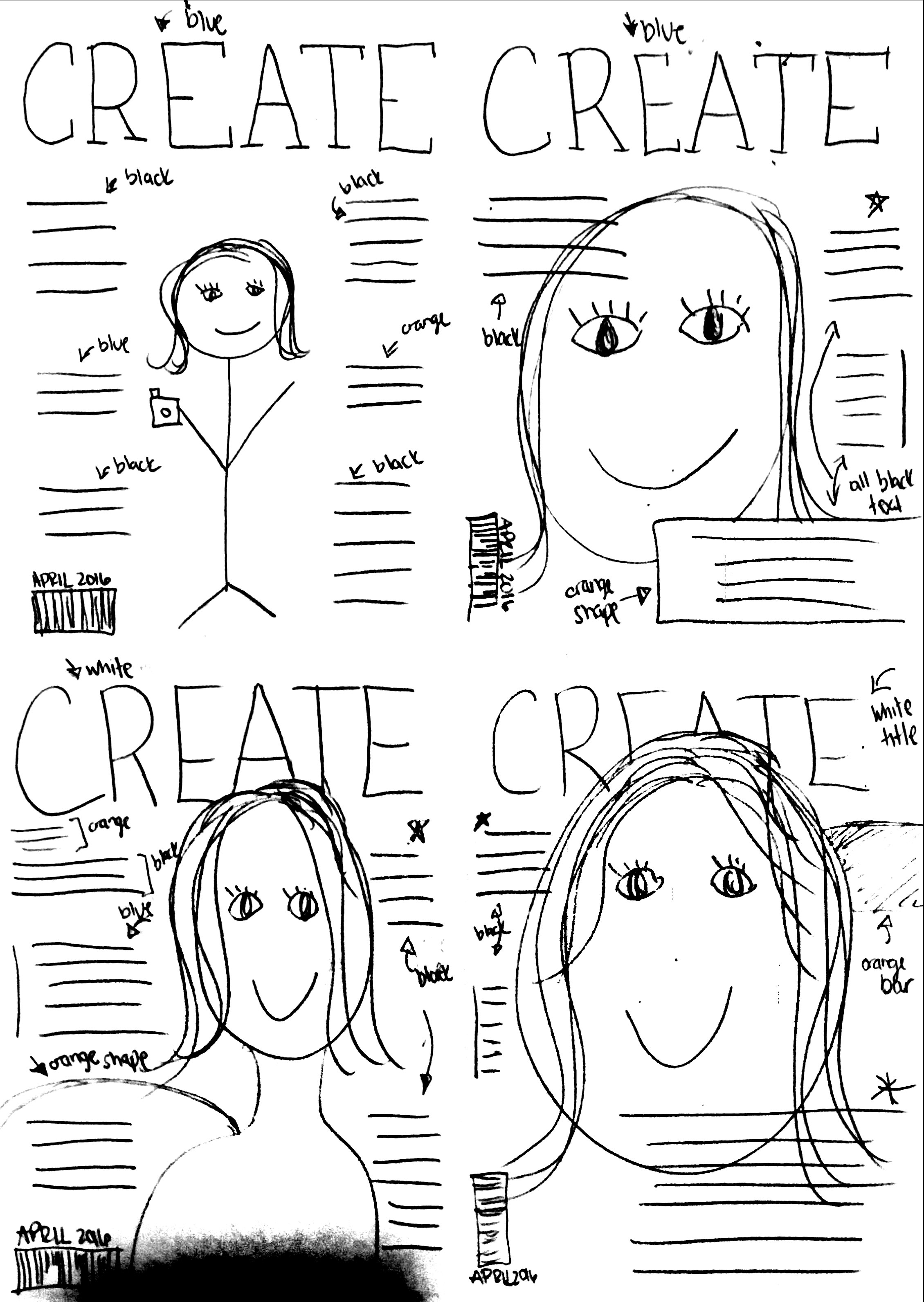
Include the following elements in your sketched layouts:
- Large eye-catching title.
- Text boxes.
- Image shapes.
- Any graphic elements.
- Color notes.
- Date & Issue Number
- Take a photo(s) of your four sketches or scan them to be included in your final blog post
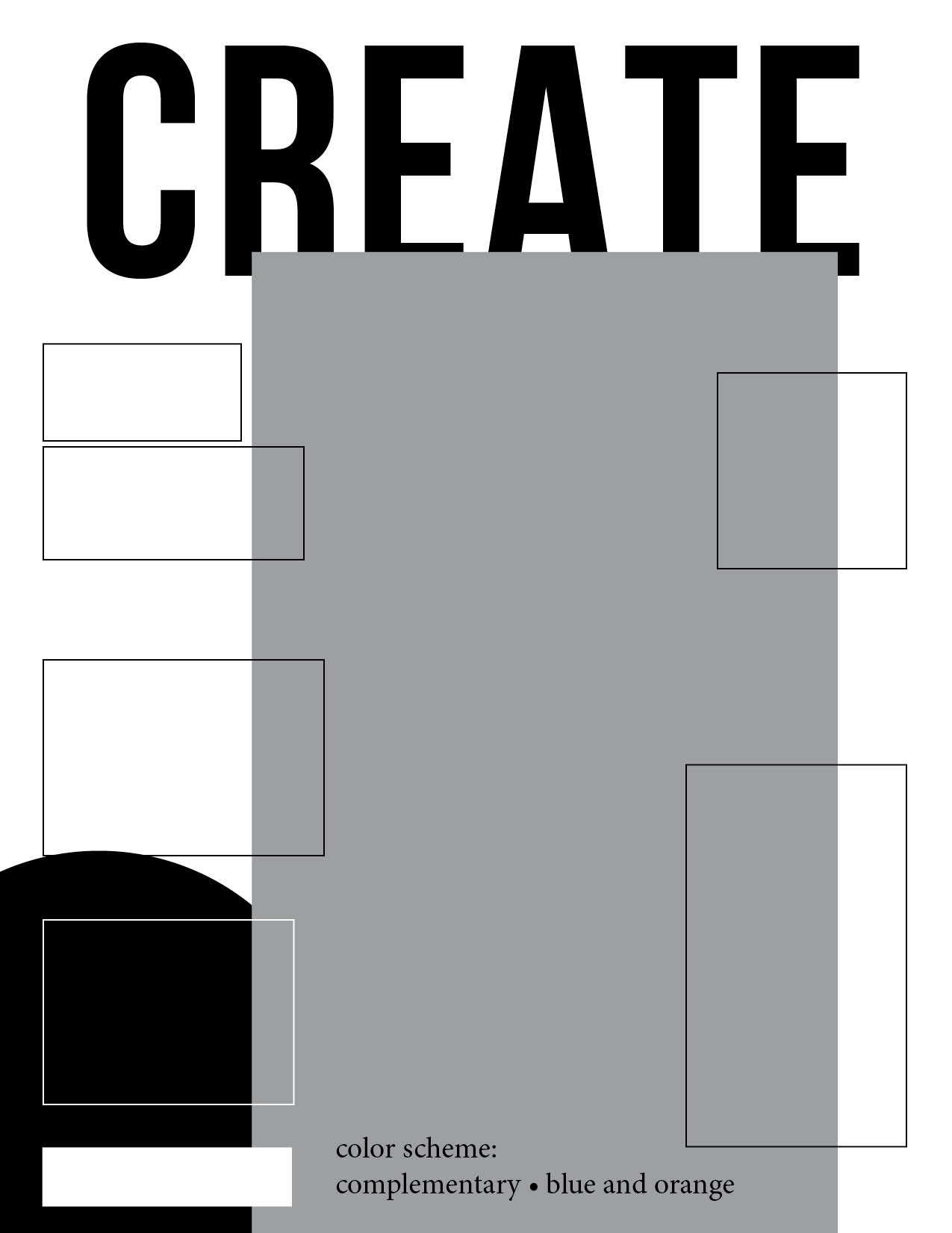
2. SHAPE MAP
Set up a new 8.5 x 11 inches InDesign document (File > New) with 0.25 inch margins and portrait orientation. Remember: Never put your text too close to the edge. Keep all text inside the margins.
Watch Part 1 (transcript) of the magazine video tutorials to match your best sketch and create a shape map. It is okay to change your idea or sketch. Your final project does not need to match your sketch exactly. Include a text box with your Color Scheme in your Shape Map. Go to File>Export and save the shape map as a JPEG at 60ppi. Click example below to enlarge:
3. DESIGN
Now that you have sketched several layout options, let’s make your ideas come to life!
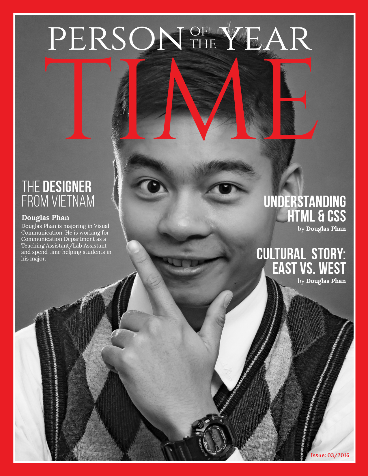
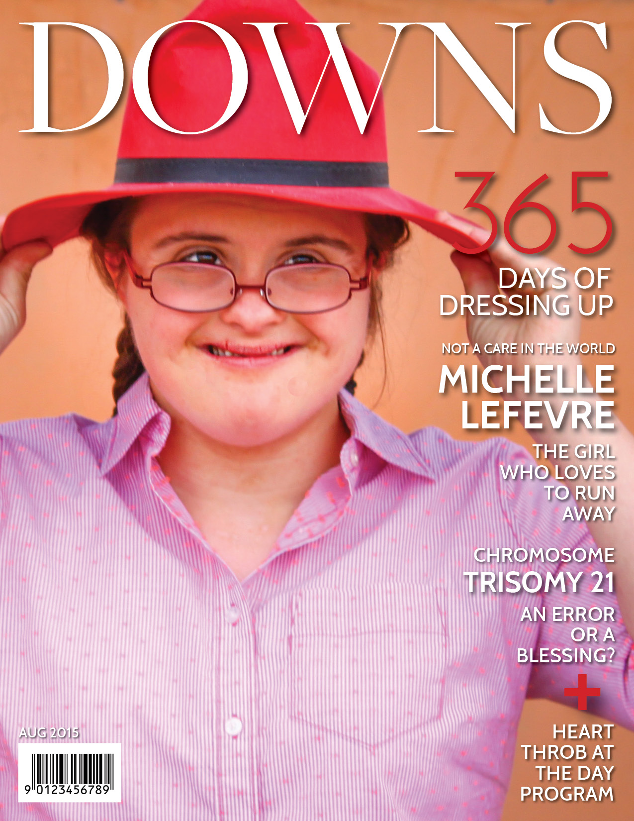
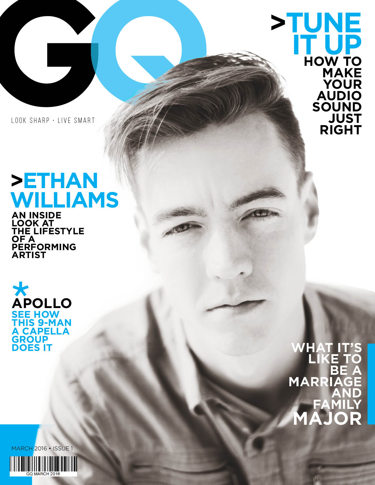
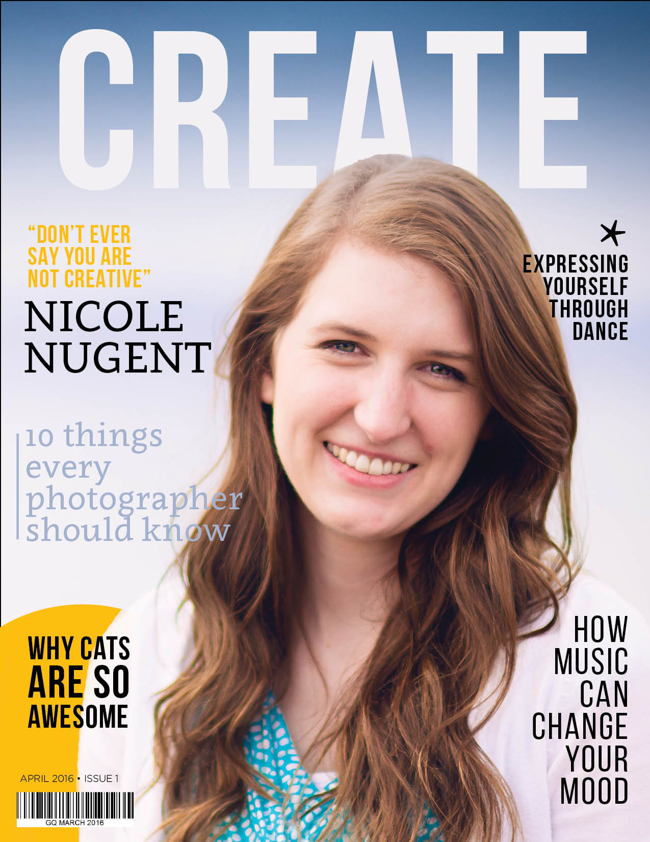
Your cover must include the following elements:
- Dimensions: 8.5 x 11 inches
- Magazine title
- 3 – 5 article titles about you
- Dominant self-portrait
- Other images (optional)
- Date & Issue number
LAYOUT:
Open your shape map in InDesign and add your elements to create your layout. Insert your title, and images/illustrations. Replace your placeholder text with your own original article titles. Follow Part 2 (transcript) of the magazine video tutorials for layout and image tips.
TYPOGRAPHY:
Choose a legible body copy typeface from an Oldstyle or sans serif category. You need to follow the typography guidelines from this course and The Non-Designer’s Design Book. Choose a title typeface and make sure it contrasts with your body copy.
TITLES:
Your cover needs to have one large, eye catching title. This title is the name of your magazine. You can use an existing company or make up your own.
Then include 3 -5 articles titles about your life. Use these titles to introduce different aspects of your life. Use creative words to create curiosity but make sure the message is easy to understand. You usually only have a few seconds to grab a potential buyer’s attention.
IMAGES:
Magazines tend to have a large dominant image of a model on the cover. For your cover, the model is you! The dominant image must be a self-portrait. You can take a new photo of yourself or use an already existing image. Model background needs to be solid. You rarely see patterned backgrounds on magazine covers because they take away from the message and are difficult to design with.
Other images may be used if they add to your cover. Only use high quality images! You will never see a pixelated or unfocused image on a magazine cover. Remember you are a design intern trying to land a career, so keep things high class and professional.
How to find quality images online.(Transcript)
4. CRITIQUE PROCESS
Find more details in Course > Critique Process Guidelines
1. Class Facebook Critique: Post jpeg or png by Tuesday 6:00am MDST
2. Client Critique: Watch Instructor critique recording on Tuesday
3. Critique Meeting: Hold a critique session before final blog post
4. Critique Report: Write a paragraph in blog post about Who-When-How-What (See Course > Critique Process)
5. PRINT & VIDEO PROCESS
Follow the instructions under Course > Print & Video Instructions
6. BLOG POST & SUBMISSION
Use 3A Sample Blog Post as a guide.
• Insert the exported JPEG (150ppi) of your final magazine cover at the top of the blog post.
• Process: Include thumbnails of your sketches and shape map in the “Process” section of your post.
• Process: Give a brief rationale / explanation of each article title.
Submission – Follow the instruction in Course > Blog Post: Submission Instructions
1. Go to project submission and attach the SCREENSHOT of your blog post.
2. Then you will be able to insert a working HYPERLINK to your blog, in the comments box.
3. State if you “attended class” by watching the entire INTRO/DEMO VIDEO and list the KEY WORDS.
NOTE: Do not submit until everything is complete. Once you submit, be sure NOT to change anything on your post, until after it is graded.
Tutorials
Rubric: (30 points)
NOTE: Meeting these minimum requirements will result in a 80% or B- grade, according to the University Grading System. To receive a higher grade, students must exceed these minimum expectations.
√ Design Principles
• Message: Clear message • Audience appeal/relevance
• Proximity: Adequate white space/grouped white space/not trapped • Proximity Grouping/adequate spacing
• Contrast: Draws eye/focus • Hierarchy • Avoid conflict
• Repetition: Repetition (elements repeat) • Unity
• Alignment: Avoid centering • Placed with purpose • Creates relationships
• Good Design, Creativity and Uniqueness, and Shows Effort
√ Typography
• No more than 2 fonts • Contrasting fonts • Title size/font contrast • Appropriate leading/kerning/tracking • Easy to read • Text spacing in box • Text not too close to edges of page or other elements • Proportional text (not squished or stretched)
• Small body copy (10-12pt) • No widows • No orphans • No underlining • No hyphens • Consistent paragraph alignment/Indenting
• Appropriate caps • Correct spelling / punctuation / grammar
√ Images & Content
• One dominant self-portrait • Good lighting • Sharp focus • High quality resolution • Solid background • 3-5 article titles about you
√ Blog Post & Submission
• Blog Post: Project at large size • Description • Well-written process (Programs/tools/skills/design principles) • Critique Report • Sketches and shape map • Message • Audience listed • Top thing learned • Color scheme and color names listed • Title/Copy font & category listed • Thumbnail of original, unedited images inserted • Link to blog post submitted • Screenshot of completed full blog post • Class Participation & Keywords • Video of printed project embedded
• Print: 8.5”x11” Full-bleed margins on all four sides. Trim only 1/8″ (0.125) from all four sides. • Print is the same as the blog post • Quality Resolution • Not printed from the blog jpeg
CAUTION: your assignment is not complete until you submit in I-Learn. However, you are allowed a one-time extension, if you choose to use your mulligan. (See syllabus). We check your blog post for completion right at the deadline, so please do not add things after submitting your link, until it has been graded.