
10A: Web Page Mockup Project


Client Situation
Preparation
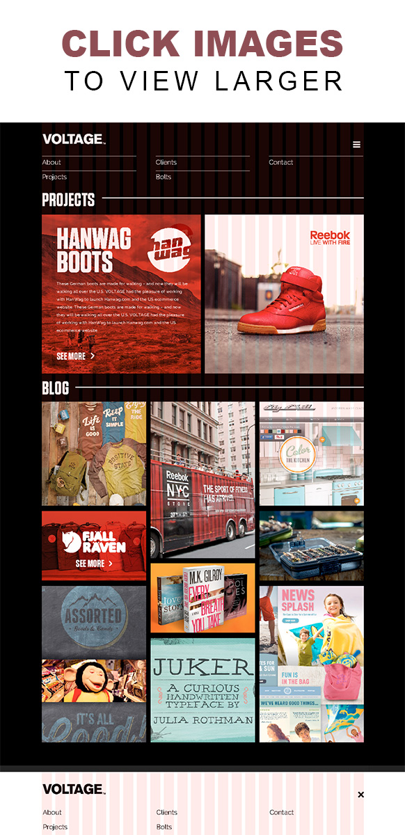
- VIEW: 10A Sample Blog Post
- TOOLS: Photoshop
- GOOGLE IT: web page design, photoshop layer comps
Design Website Layout Adobe Photoshop - RESOURCES: Web Page Video Walkthrough (Transcript), http://960.gs, Tips for Designing with a GRID
- ADDITIONAL LEARNING: Photoshop has a neat feature called “layer comps”. Check out these two videos to learn more.
Part 1 Instructions: Sketches
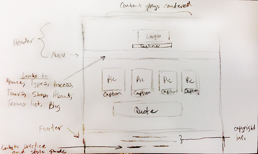
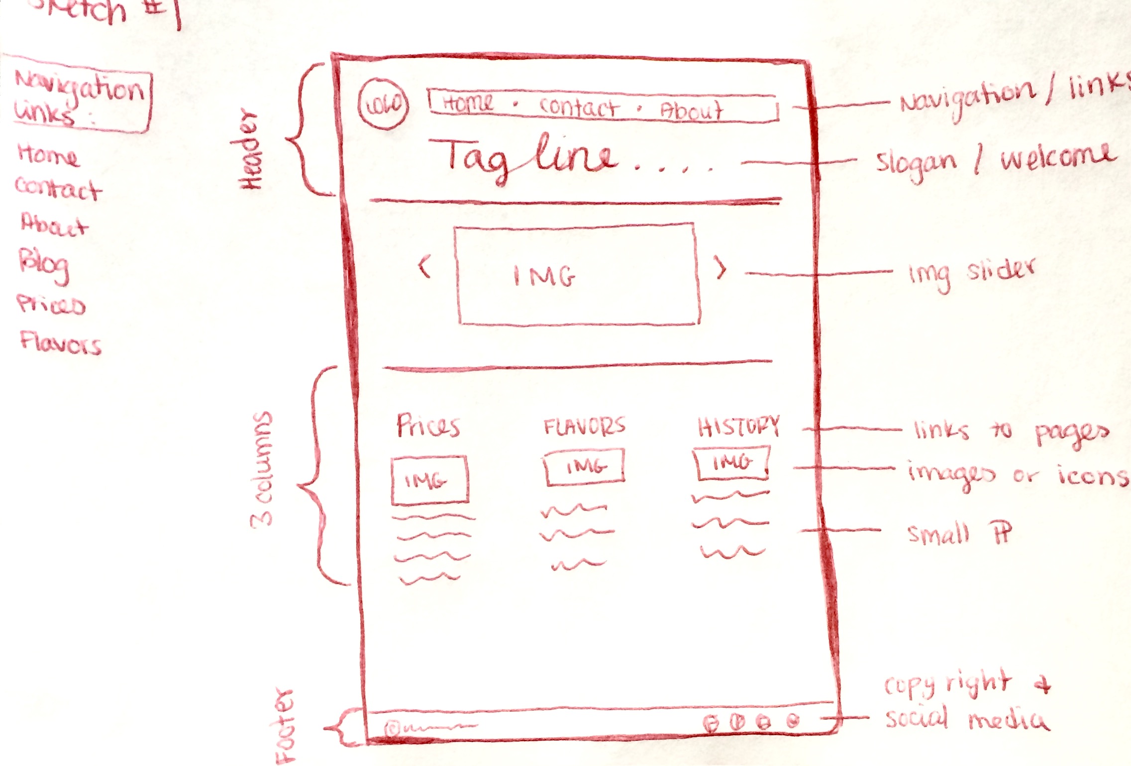
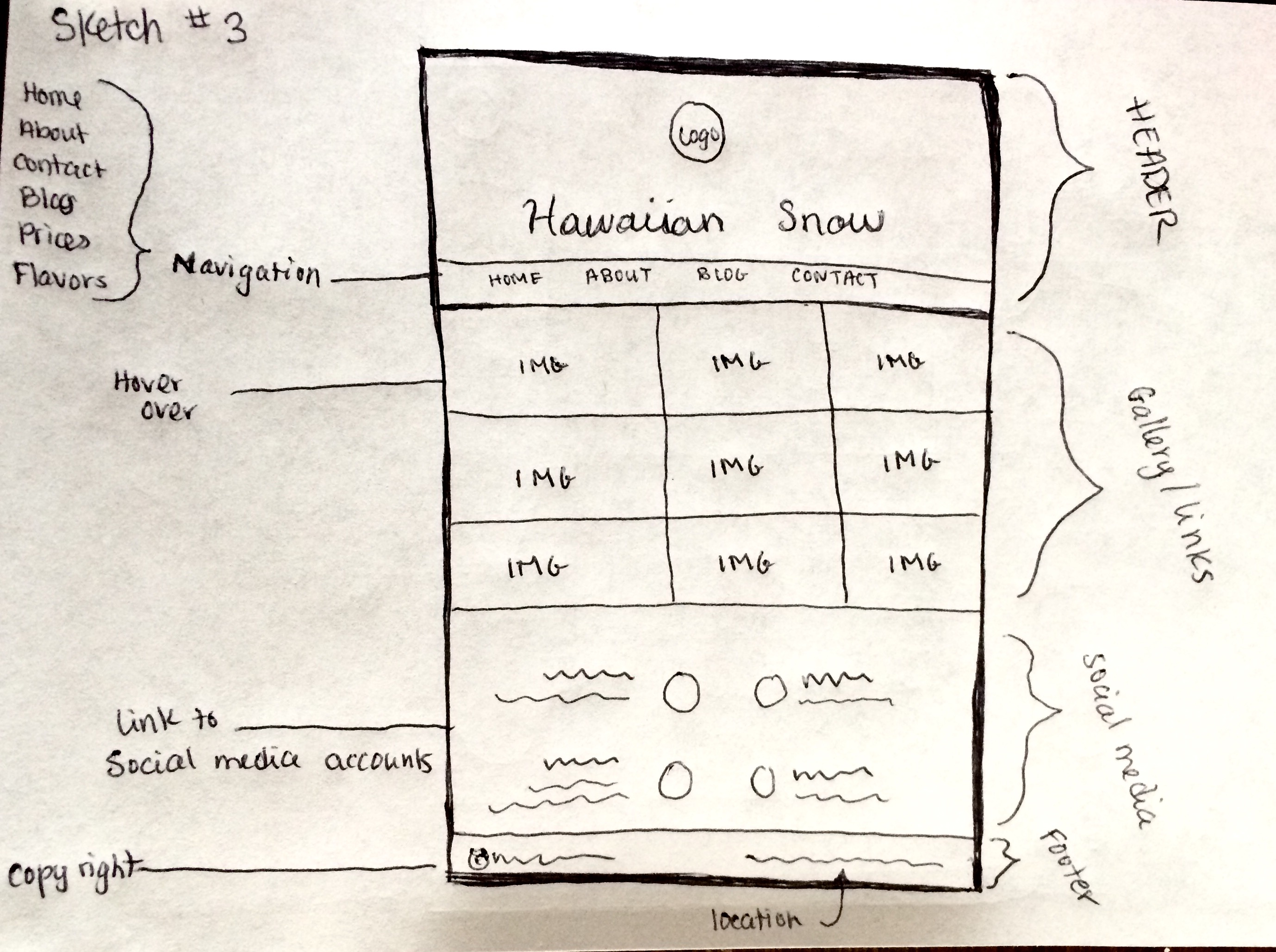
BRAINSTORM AND SKETCH.
You may use the company from your business identity project or a company of your choice for the basis of this project. Consider the demographics of your audience, and start sketching ideas to communicate the message to that audience. Be sure to include all the home page elements listed below. Be sure you label each element as shown in the example below. Take a photo (phone pic is fine) of 3 sketches to include in your project blog post.
Name the images according to the following format: 10A-Sketch-JakeSpencer-1.jpg, 10A-Sketch-JakeSpencer-2.jpg, etc.
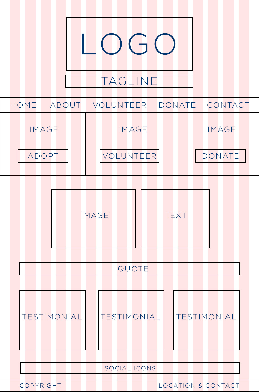
Include these elements in your Sketch: See examples below…
Header • Logo • Navigation (with link names for 5 pages) • Boxes for images • Boxes for text • Labels (images, text, links, copyright, etc.) • Footer • Any other key elements
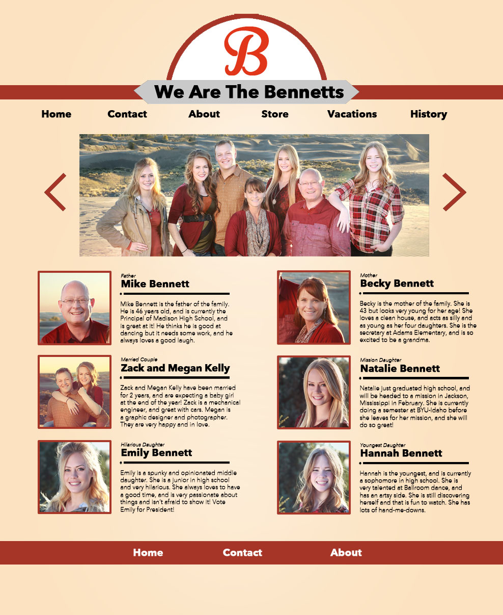
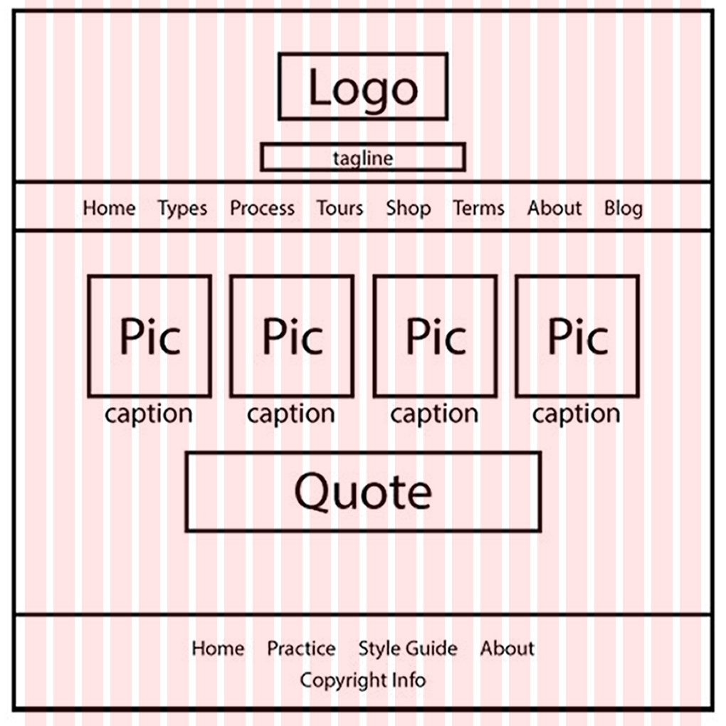
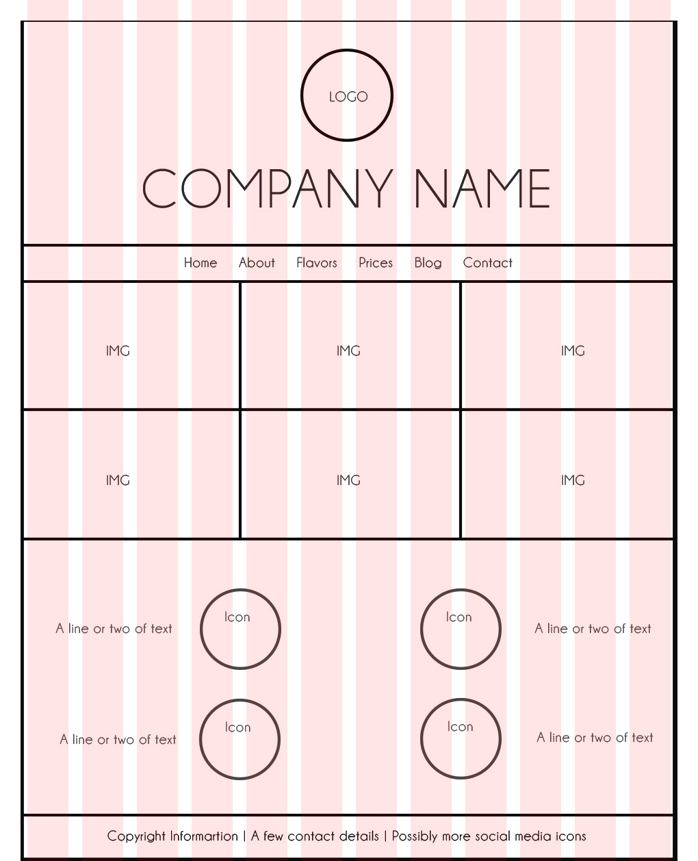
Part 2 Instructions: Shape Map (Wireframe)
Designers call it a shape map, mockup, or digital sketch. Web developers may call it a wireframe. Use your sketch to create a digital “Shape Map” in Photoshop.
Download this base Photoshop file by the 960 Grid System.
Designing based on a grid helps designers maintain alignment and spacing. Your web developer has requested that you use a grid, so click the link above, then download and unzip the folder. Use one of the column grids in the folder as a guide to create your wireframe. See helpful “grid” tips here and examples at http://960.gs. You may add more to the length depending on how much scrolling you want on your home page. You can always add to the canvas size (Image—Canvas Size.) Consider your negative and positive space and be sure to group your related items together for good proximity.
Include all the same elements and labels in your Shape Map that you had in your Sketch. See list above and see example below.
Save your file as a .psd for future editing. Also save the file according to the following format: 10A-ShapeMap-JakeSpencer.jpg. You will include this JPG in your project blog post.
Note: It’s a good idea to stay organized with folders and layers in Photoshop. Make sure you name each layer with a title so you know what it is (double click the layer name to change it) and even use folders to group layers that are similar together. (In the layers pallet, at the bottom, there is an icon that will allow you to create a new folder. Then click and drag layers into that folder.)
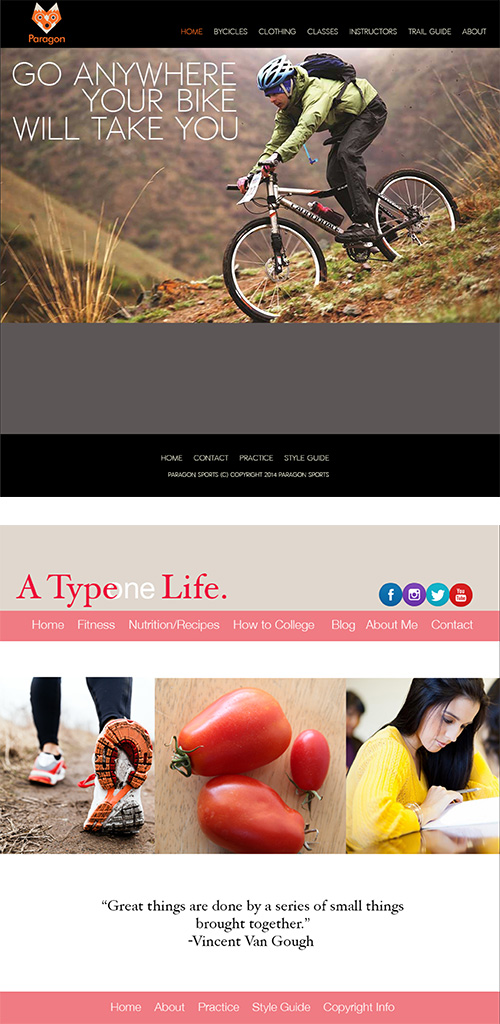
Part 3 Instructions: Web Page Prototype
Your final layout should be a refined version of the shape map (wireframe) you created, with all the content added. It does not need to exactly match your original sketch; it is okay if you make tweaks or changes throughout the processes. The example at the right shows a website on top of a 16 column grid.
1. WELL DESIGNED .PSD FILE
You will deliver a well-organized .psd file to the web developer as the web page prototype so he/she can use the layers and grid measurements, if needed. Using your grid layout and your wireframe, refine your web design using the basic tools in Adobe Photoshop (google it: “Design Website Layout Adobe Photoshop“)
2. SAVE PDF FOR CRITIQUES
Hide the grid layer and save the file as a PDF from Photoshop to share your layout with evaluators. Gather critique and make appropriate adjustments to your design.
Note: Avoid using smart layers when designing this layout in Photoshop. They often make your Photoshop document very large, and thus hard to upload/download. Your final PSD should not be over 5MB in size.
Part 4 Instructions: Finishing the Project
1. CRITIQUE PROCESS
Find more details in Course > Critique Process
1. Class Facebook Critique: Post jpeg or png by Tuesday 6:00am MDST
2. Client Critique: Watch Instructor critique recording on Tuesday
3. Critique Meeting: Hold a critique session before final blog post
4. Critique Report: Write a paragraph in blog post about Who-When-How-What (See Course > Critique Process)
2. BLOG POST & SUBMISSION
Create a zipped folder with your .psd document and screenshot of blog post.
Use 10A Sample Blog Post as a guide.
Submission – Find more details in Course > Blog Post: Submission Instructions
1. Go to project submission and attach the ZIP FOLDER of your blog post.
2. Then you will be able to insert a working HYPERLINK to your blog, in the comments box.
3. State if you “attended class” by watching the entire INTRO/DEMO VIDEO and list the KEY WORDS.
NOTE: Do not submit until everything is complete. Once you submit, be sure NOT to change anything on your post, until after it is graded.
Rubric
NOTE: Meeting the minimum requirements is “average” and constitutes an 80% or B- grade, according to the University Grading Guide. To receive a higher grade, students should excel.
√ Design Principles
• Message: Clear message • Audience appeal/relevance
• Proximity: Adequate white space/grouped white space/not trapped • Proximity Grouping/adequate spacing
• Contrast: Draws eye/focus • Hierarchy • Avoid conflict
• Repetition: Repetition (elements repeat) • Unity
• Alignment: Avoid centering • Placed with purpose • Creates relationships
• Good Design, Creativity and Uniqueness, and Shows Effort
√ Layout
• Includes the content requirements; Quality images; Design element
√ Typography
• Typography rules followed; contrasting typography; title; navigation menu
√ PSD File
• Organized layers in folders; all layers are named descriptively
√ Blog Post & Submission
• Blog Post: Three images displayed at Large size (quality JPEG of project; quality wireframe; quality sketches) • Description • Well-written process (Programs/tools/skills/design principles) • Critique Report • Message • Audience listed • Top thing learned • Colors scheme and color names listed • Title/Copy font & category listed • Thumbnail of original, unedited image inserted • Date and location you took the photo(s) • Link to blog post • Screenshot of completed full blog post • Class Participation & Keywords
CAUTION: your assignment is not complete until you submit in I-Learn. However, you are allowed a one-time extension, if you choose to use your mulligan. (See syllabus). We check your blog post for completion right at the deadline, so please do not add things after submitting your link, until it has been graded.